Humans have always been pretty obsessed with shapes and designs. Creating a masterpiece that makes the eyes become wide open and surprising the mind with intricacy in the simplicity has always been considered a marvel. Just that the canvas for our artists has shifted from buildings and walls to paper and cloth and if we consider it precisely today’s time, to mobile and desktop apps.
Art and design have not just shifted their form over the centuries, they also change their trends from intricacy to simplicity and back to compactness again. If we talk specifically about mobile app design trends in 2021, you are most likely to observe a well-balanced package of concision, simplicity with an easy-to-navigate but compact packing of features.
The smartphone industry changes every 2 to 3 years in terms of hardware and the same effect is then translated into facelifts for apps and other updates. 2021 is going to be another year packed with excitement around both hardware and software but it will especially try to make good use of the immense processing power packed into our smartphones, rapid 5G connectivity, and the imaginary but still real-world of artificial intelligence and augmented reality.
Let’s dive a bit deeper into what 2021 has in-house for us when it comes to the latest design trends for mobile apps.
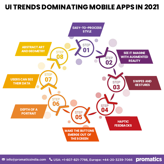
Easy-to-process style
The world has gone entirely digital to almost 100% where a vast majority of us are looking at screens from the moment we open our eyes to the time we put our phone aside and lay down for a night’s sleep. Viewing screens of all sizes, shapes and color schemes, it becomes very strenuous for the user to keep up and eventually begins to compromise on his usage.
Mobile apps in 2021 will feature a design and color scheme trend that is easy on the eyes. This includes avoiding high contrast color combinations, stacking up menus unnecessarily, and overloading options in the same view. You may also come across apps that use portraits as their background. Such implementations help the user in fulfilling his needs with your apps without getting tired or fatigued.
See it imagine with Augmented Reality
Augmented reality allows you to point your smartphone camera in a certain direction and see space fill up with an item of your choice. It can be an emoji for your Snapchat story or it can be an online car exhibition using AR or it can be your shopping app that allows buyers to see the phone imagine how the product will look like on the user himself or on his desktop or in his living room.
IKEA has implemented the concept very intelligently by incorporating AR in their online shopping app. As you are buying furniture online, you will have an option to see it in a space you’d like to put it and have a precise idea of where to put it or even buy it or not.
AR particularly has the potential in the e-commerce world and can help to minimize the trust gap that exists between an online buyer and a seller.
Swipes and gestures
The smartphone interfaces and operating systems come with inbuilt gestures and swipe actions that allow to perform certain tasks. However, the same can even be implemented in your app where you can use swipe to toggle between menus and use the screen move conveniently.
Smartphone displays have gotten significantly larger in the last couple of years and it is not always possible to move your thumb across the entire screen to touch a button. In such a case, if you can just swipe the item to some set of option or pull up a drawer at the bottom when in need, can be very convenient.
Unify your data from app stores in one dashboard
With benchmarking tools, Data.ai’s latest data product allows you to see how your app contrasts to market estimates of a predefined or customizable app group.
Connect today!Surprisingly the swipe concept has been used in Google apps such as Gmail or Messages where you push an item to the left and you can get your option to open, forward or delete the message.
Haptic feedback
Haptics is another thing that caught the attention of the reviewers and tech companies recently. Basically, you have a small vibration motor installed in your smartphone that generates the vibrations when you put it in silent mode.
While the primary purpose of a haptic feedback motor might be just to notify a call in a meeting, it can be used to improve the user experience by making it livelier. Keyboard vibrations are not a new thing. You tap a key while typing and you feel a vibration so you know you have hit a key.
However, now that technology has improved and the haptic motors have been more advanced than they were in 2010, you can generate more complex vibrations and make your app feel like it breathes and reacts with the phone.
For example, your online delivery app makes a hum when the rider arrives as if it can smell the food. There is no limit to imagination and possibilities in today’s world.
Make the buttons emerge out of the screen
Optical illusions are fun to create and create a unique and playful viewing experience. Luckily the same can be done with your mobile app interface that can look like buttons bulging out of the screen.
This novel concept is called ‘new skeuomorphism’ or ‘neumorphism’ that uses high contrasts and shadows to convert flat buttons and icons on your screen into a three-dimensional shape place on a table or carved out of it. In this way, your music app can look like a DJ’s equipment and appear realistic enough to feel like one.
The screen will still continue to be flat but will look deeper with more detail. This is a particularly eye-catching concept and will make your app stand out from the crowd.
Depth of a portrait
While one design trend tries to make the button emerge out, the other trend is to make the mobile screen look like a window to see into another world. While it may be another idea from 2013, it is being implemented more accurately and looks more realistic thanks to the 120 Hz, 4K resolution displays that make you feel present at the moment.
Different categories of options can be layered and look like cards that the user can shuffle through and use the features he/she desires. Small depictions of the physical world have always been much appreciated by the users and you can do the same for your app as well.
Users can see their data
With the rising concerns about privacy and improved regulations in recent years, data has become important for even an average smartphone user who just uses it to call his friends and book an Uber every now and then.
Allowing users to view information about their app usage can create an air of transparency and trust between the user and the company and add to your app’s goodwill.
Similarly, displaying information about a user’s activities including sleep time, work duration, steps walked in especially something like a fitness app can be very helpful for the user and aid to increase his app usage time and frequency.
Not only just fitness apps, but this can also be used for any app to show metrics that are important for the user. A game developing company can show users information about their track record, best moves in a session, and a comparison with the user’s friends. A taxi booking app can show a trend about the availability of drivers, peak hours, and a graph of traveling history during the past month.
Just keep two things in mind when you opt to display data in your app:
- Be creative, play around with color and designs until you have one that suits your app’s theme and purpose.
- Be thoughtful, the user should drive actual value from your representation and should not be just some fancy bars that are a beautiful thing to look at and serve no actual purpose.
Abstract art and geometry
Many of the apps these days are startups that do not have a budget thick enough that they can bear the expenses of a professional photographer/videographer. They can either choose to spend on the features of their app or make it look more appealing.
Abstract art and geometry provide a middle way out for such companies that want their apps to look great. They can use computer created designs that promise to deliver a quality experience with a relatively lower amount of expenditure.
The important point to be mindful of here is that the designs and imagery should not be so overwhelming that the actual interface of your app is pushed into the shadows.
In the nutshell…
The world of mobile app designs a consistently changing one and innovation is the best way to be ahead of others. Experiment with your betas, think outside of the box and reconsider your budget utilization.
Breaching the boundaries is the only way you can deliver a unique, seamless and catchy design to your user.


